Morgan Kellman 2014
Thursday, 7 May 2015
Friday, 17 April 2015
Question 1
In what ways does your media
product use, develop or challenge forms and conventions of real media products?
Jump scares are also common in a horror film. It is used in films such as Annabelle. it is used to make the audience jump and making them want to keep on watching. We did this when the ghost moves into the camera.
Disabilities are also common in horror films. For example Nightmare On Elm Street, Freddie Kruegger is scarred for life because of burns. we used this on shannons arm where she had been burnt.
Titles are typically used as a convention of an opening sequence. They are used to tell you the names of the actors, distribution and producers. We made our own titles in our project to say the actors names that are in the film. You can see titles used in films such as spiderman, which is also known as a title sequence at the start as it does not have acting it has titles.
production idents are used to say the name of the production company. Every film has a production company to sell their product, for example batman begins has a production ident using characters from the dc universe. We had used a crow symbol to show that it was a horror. it is used at the start of a opening sequence .
montage is used in a small minority of films. it is used to show what has happened in past films. We have used a montage later on in the project to show what characters are doing and how they are feeling. Like when it cuts to shannon burning her arm. a montage is used in films such as the borune legacy.
Soundtrack is used to make an opening sequence more interesting. it is used in every single opening sequence because without it it wouldnt be very interesting. We decided to use it through out the entirety of our clip because it can also determine how a character is feeling. For example if you have slow music they may be feeling upset.
Distribution is always shown in an opening sequance. A good example of a distribution is lionsgate because it is well known around the world and is highly respected. This means that there is more chance of an audience watching it if there is a popular distribution behind the making of the film. we decided to use lionsgate.
Name of film is also shown in most opening sequences. for it is shown at the start of most lionsgate productions. we decided to use a different font on ours so that you know that it is the main title and so that you know what the film is actually called. The main title needs to be obvious and it needs to use bright colours to ttract the audiences eyes.
Slow paced editing is typically used as a convention of a horror. It is used to create a feeling of tension or suspense. For example in 'The Ring' when the woman gets the phone call, this scene is extended to show the audience how she is feeling at that given moment in time and also shows a lot of suspense and tension. We have used slow paced editing in the scene where the girl is walking down the hall way and in the end when our protagonist is getting ready. We have used it for exactly the same reason as the clip, to make the audience feel uncomfortable.
Faced paced editing is also used as a convention. It is used to make it feel like there is a lot happening at once and creates the feeling of tension. Again, it is used in the ring, when it shows the girl looking at the TV (Do not click on the GIF, It will play full video). We decided to do this at the end because it relieves the tension that is built up through out the clip.
Blood is also used as a convention. It is to make it seem like a lot has happened in a certain place and sometimes to make the audience feel uncomfortable. This is used in films such as Saw. We decided to use blood in our project because we wanted to make it look like the protagonist has been hurt in some sort of way.
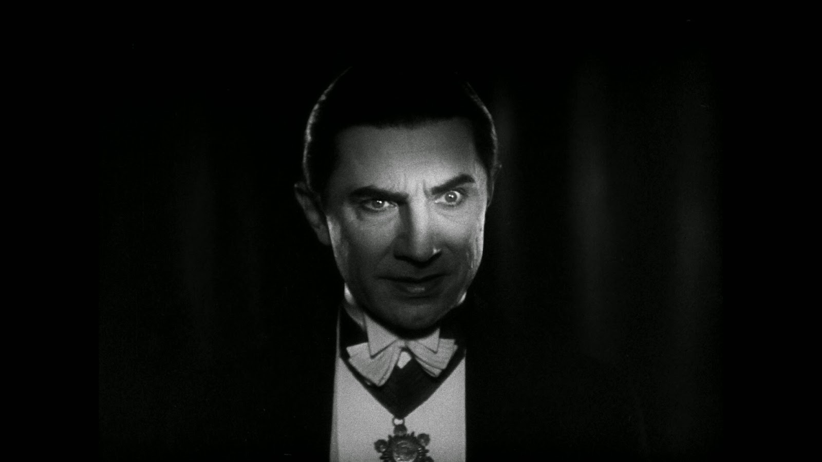
Low key Lighting is also used as a convention of the horror genre. It is used in films such as Dracula to make a character seem more scary or aggressive. We used Low Key Lighting in some of our shots to make the ghost seem more scary and powerful compared to the rest of the characters.
Blood is also used as a convention. It is to make it seem like a lot has happened in a certain place and sometimes to make the audience feel uncomfortable. This is used in films such as Saw. We decided to use blood in our project because we wanted to make it look like the protagonist has been hurt in some sort of way.

Low key Lighting is also used as a convention of the horror genre. It is used in films such as Dracula to make a character seem more scary or aggressive. We used Low Key Lighting in some of our shots to make the ghost seem more scary and powerful compared to the rest of the characters.
Jump scares are also common in a horror film. It is used in films such as Annabelle. it is used to make the audience jump and making them want to keep on watching. We did this when the ghost moves into the camera.
Disabilities are also common in horror films. For example Nightmare On Elm Street, Freddie Kruegger is scarred for life because of burns. we used this on shannons arm where she had been burnt.
Thursday, 16 April 2015
Question 7
7 Looking back at your preliminary task, what do you feel you have learnt in the progression from it to the full product?
Looking back at my preliminary task i have learnt a lot more skills. For example i have expanded my knowledge on shot types, angles and continuity. I can now pick out when we have made a mistake and therefore change it to get a higher grade. I have also expanded my editing knowledge because of practice on Premier Pro. I now know how to use key framing in order to make a object move across the screen, how to make an object zoom in and out all because of this skill. I have also learnt how to create titles in side of premier pro, however i did not use this skill in the product. We decided to use photohop instead because we can customize the titles how we please without struggle.
I have also learnt how to use the DSLR Cameras to create more unique and interesting shots, for example the shot of our protagonist in bed. This shot is interesting because it makes you wonder what is going to happen within the next couple of seconds of the shot.
I have also learnt how to edit to create more interesting scenes, for example the jump cut that we used when our protagonist sits up. We decided to do this because it confuses the audience. It also gives an uneasy feel because they wonder why it has happened.
I have also learnt how to use photoshop to create more interesting fonts and more interesting titles, an example of this is the main title which uses a glow, however i had to use the mast tool to create another layer over the top of the last layer. There is a tutorial on my blog of how i learnt how to do it. I found it very informative and helpful and the end result of the title was very good.
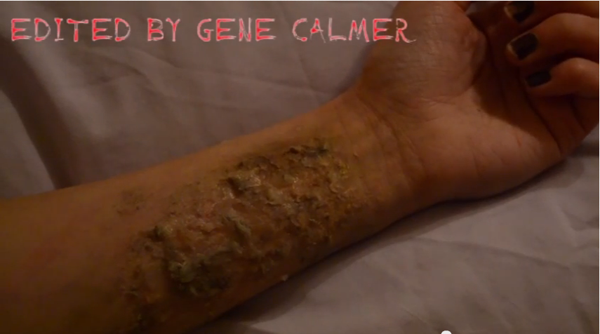
I also learnt about mise en scene. Whilst we were filming we had to reshoot many shots because the lighting wasnt right or because the settings didnt match where the character is going. The shot of the main characters arms was also re shot because the lighting was not the same. we encountered this many times. For example in the shot where the main character is burning her arm. We had to consider lighting here because it is a very dark scene. However we decided to keep it dark because it fits the genre.
Looking back at my preliminary task i have learnt a lot more skills. For example i have expanded my knowledge on shot types, angles and continuity. I can now pick out when we have made a mistake and therefore change it to get a higher grade. I have also expanded my editing knowledge because of practice on Premier Pro. I now know how to use key framing in order to make a object move across the screen, how to make an object zoom in and out all because of this skill. I have also learnt how to create titles in side of premier pro, however i did not use this skill in the product. We decided to use photohop instead because we can customize the titles how we please without struggle.
I have also learnt how to use the DSLR Cameras to create more unique and interesting shots, for example the shot of our protagonist in bed. This shot is interesting because it makes you wonder what is going to happen within the next couple of seconds of the shot.
I have also learnt how to edit to create more interesting scenes, for example the jump cut that we used when our protagonist sits up. We decided to do this because it confuses the audience. It also gives an uneasy feel because they wonder why it has happened.
I have also learnt how to use photoshop to create more interesting fonts and more interesting titles, an example of this is the main title which uses a glow, however i had to use the mast tool to create another layer over the top of the last layer. There is a tutorial on my blog of how i learnt how to do it. I found it very informative and helpful and the end result of the title was very good.
This is the final product.
I also learnt various camerawork techniques. For example we decided to use a lot of different types of shots and angles. a good example of this is when we did a low angle of a light bulb, we did a point of view shot and a low high angle of the protagonist looking at her arm. This shows some of the camera work techniques i learnt whilst we were shooting our product.
I also learnt about mise en scene. Whilst we were filming we had to reshoot many shots because the lighting wasnt right or because the settings didnt match where the character is going. The shot of the main characters arms was also re shot because the lighting was not the same. we encountered this many times. For example in the shot where the main character is burning her arm. We had to consider lighting here because it is a very dark scene. However we decided to keep it dark because it fits the genre.

Tuesday, 14 April 2015
6 What have you learnt about technologies from the process of constructing this product?
6 What have you learnt about technologies from the process of constructing this product?
throughout the process of constructing the product i have learnt how to use photoshop. An example of where i have used photoshop are the titles. We decided to use photoshop so that we can customize the titles how we wanted to. I had to do research on how to do a few things which further broadened my knowledge of how to use photoshop to apply glow. An example of where we used glow is the 'Dark Nightmare' Main title. This shows one example of a technology that i have learnt about whilst constructing the product.
Another example is the use of a go pro. We decided to use a go pro for a shot so that we could slow down a shot without it being jittery. Another reason we used a go pro is so that we could expand our knowledge and learn how to use different types of cameras. This is another example of a technology which we have learnt how to use through constructing the product.
We used blogger to keep track of our work so that it can be marked. We decided to use blogger because it is very easy to use and we can access it from home so that we can do work away from controlled conditions. Blogger was the best option because it is very quick and we can keep updating our work without trouble. It is also available across all platforms of computers. This means that everyone should be able to access their work without struggling.
We used premier pro to edit all of our work together. The final product was completed through premier pro. We used this because it is easy to use when you get your head around it. It also has many transitions and effects that we can use if we wanted to use them. Premier pro is also made by adobe so it is a reliable source for us to use. It runs easily on the macs and allows us to change the final product into the format that we wish for it to be in.
3 What kind of media institution might distribute your media product and why?
3 What kind of media institution might distribute your media product and why?
We would have to use a film institution to distribute our media product. My preference was lionsgate for several reasons. The first reason is because it covers a variety of genres such as horror, Action adventure and comedy. The second reason is because is largely recognised. This means that our film opening looks more mainstream and professional. The final reason is because lions gate are strongly respected as a company around the world meaning more people would watch the film if it is a respected company that are producing it.
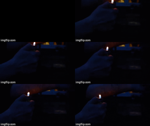
We decided for our company to be called Black Crow Productions because it fits the horror genre. For example we know that crows are stereotypically portrayed in death or are portrayed as evil. This fits the horror genre because obviously horror is meant to be evil. We also decided to have a crow because they are dark. This matches the horror genre because stereotypically it is supposed to have mostly low key lighting. This means that most of the shots were supposed to be in darkness or only use one shot of light. You can see an example of this when you see someone burning their arm, the only light we use is the light from the lighter.
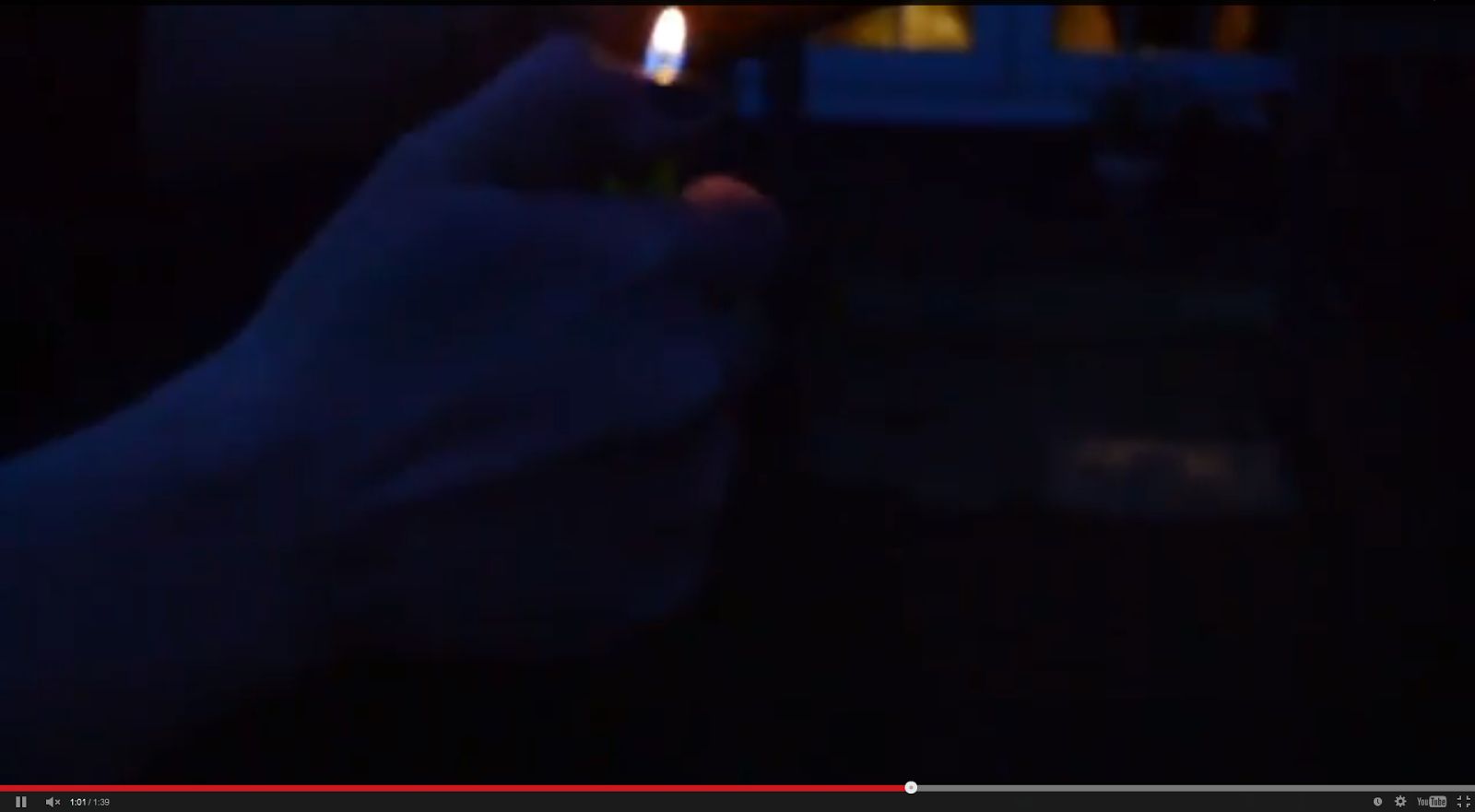 As you can see there is only one type of light in focus in the shot.
We would have to use a film institution to distribute our media product. My preference was lionsgate for several reasons. The first reason is because it covers a variety of genres such as horror, Action adventure and comedy. The second reason is because is largely recognised. This means that our film opening looks more mainstream and professional. The final reason is because lions gate are strongly respected as a company around the world meaning more people would watch the film if it is a respected company that are producing it.
We decided for our company to be called Black Crow Productions because it fits the horror genre. For example we know that crows are stereotypically portrayed in death or are portrayed as evil. This fits the horror genre because obviously horror is meant to be evil. We also decided to have a crow because they are dark. This matches the horror genre because stereotypically it is supposed to have mostly low key lighting. This means that most of the shots were supposed to be in darkness or only use one shot of light. You can see an example of this when you see someone burning their arm, the only light we use is the light from the lighter.
 As you can see there is only one type of light in focus in the shot.
 2 How does your media product represent particular social groups?
2 How does your media product represent particular social groups?
Our media product represents many social groups differently. For example we have a female protagonist. This means that woman are portrayed to be stronger than males and that they have more power in the circumstances that the protagonist is put in. We also have a teenager as our protagonist which means that teenagers are more likely to be able to survive in the film. Also having a teenager playing a protagonist role it widens our audience so that it reaches teenagers as well as adults. A good example of a weak woman is the main character's wife , Wendy Torrance, in the Shining. In the film she is shown to be intimidated very easily and made the victim. This is a very good example of a woman who is weak in horror film.
This is the protagonist for our film. There is a scene where she decides to burn her arm. This means that she is very strong as she can handle physical and mental pain.
This is the scar that the main character gets from the burn. This shows that we are going against stereotypes of females characters being labeled as weak. Our protagonist is independent and strong.
We also break the stereotype of mental illnesses . For example the main character is very strong and is treated normally. Stereotypically people with mental illnesses are perceived to be weak and different to everyone else.
Thursday, 12 March 2015
Final Copy
This is the final media production. We decided to add more content near the end of the piece. this extended the amount of time and made the whole thing more realistic. It makes the audience want to keep on watching. it makes the film seem more realistic and makes the film seem like it makes sense. Overall i believe that we have used a variety of different camera shot and have used a variety of different shots and effects. You can see this just after the light bulb when we did the fade effect. We have also used a variety of different skills throughout the course. A good example of this is a voice over which we used at the start of the project. We decided to created a voice over because we felt like the clip needed some context and some explanation of our ideas and the story. I believe we have some good ideas. I also learned some Photoshop skills along the way. For example i learned how to fade the text into the background using the gradient tool and the over mask tool on photoshop. This created a ghostly effect and was conventional of the horror genre. We have also used a variety of different transitions through out the course. For example we have learned how to fade music out using the fading tool. We had to also do some of the shots using our own time. We all had to agree to a time when we were free and had to book a camera from our technician.
Thursday, 5 March 2015
BLUR
This is a tutorial on how to do the blur which we used for our main title. It is very detailed and improved my knowledge of photoshop and allowed me to learn new skills. An example of this is being able to use a gradient over a text that is selected. I believe that the blur looks very nice and is very conventional of the horror genre, this is because the words fade away into darkness. This could help with a theme that darkness is prevailing over light. This is very typical of the horror genre.
Me and my group decided to use this idea for our main title. I believe that it is very conventional of a horror genre. I believe this because when you look at the text it looks like it is fading away into darkness and that's what horror films are about. Another reason is because it looks really good and fits our opening sequence.
Tuesday, 3 March 2015
New Production Ident
This is the new Production ident for my group. It is a lot more simple than the last one and looks a lot smoother and professional. It consists of a logo and the name of the producers. We decided against the first ident because it did not look good against a cloudy background, and having a black symbol on a white background is more clear and easier to understand. However there are improvements that are still needed. For example we know that there is still no music or sound effects in the background of the ident. This is not typical of any films as they normally have some type of sound to go with the animations. This means that we need to add these improvements for our opening to be conventional.
Production Idents should be simple and not to confusing. This is because if a production ident looks busy it may take your interest away from the film.This is why i have decided to use a icon in stead of a moving object across a screen. i believe that this looks a lot more neat and professional. Also, the production ident should fit with the genre of the film. This is why i used a crow for the logo as crows are conveyed as dark or evil.
Thursday, 12 February 2015
Voice Over
This is one of the voice over scripts that we could use for our opening. The voice over is going to be used at the start of our sequence after the production ident because this is conventional of a horror.
The horror genre also uses a lot of tension and a lot of pauses in between the words. this is why i have decided to use the '...'s. these are classed as pauses. i tried to show the story line in the voice over because this is also typical of a horror film. I used the title of the film on the voice over because it emphasizes the title later on in the opening. Shannon has also done a voice over so we will decide which one fits the film more and pick which one we will use. Improvements that should be made are i should have said where the pauses are and i should have changed my voice when i was making the voice over, however i believe it fits the genre of our piece.
The horror genre also uses a lot of tension and a lot of pauses in between the words. this is why i have decided to use the '...'s. these are classed as pauses. i tried to show the story line in the voice over because this is also typical of a horror film. I used the title of the film on the voice over because it emphasizes the title later on in the opening. Shannon has also done a voice over so we will decide which one fits the film more and pick which one we will use. Improvements that should be made are i should have said where the pauses are and i should have changed my voice when i was making the voice over, however i believe it fits the genre of our piece.
Tuesday, 10 February 2015
Film Name Suggestion
We considered changing the name of our opening to 'Dark Delusion' . We decided this because we believed that the title of 'Dark Nightmare' sounded very vague. We then decided to turn against re naming it because most horror movie titles are very vague as well. An example of this is 'The Exorcist'. This title is straight to the point and tells us about the meaning of the film just through the title. this is a main part of the opening sequence because if it does not match the contents of the opening it will not make sense for the audience. It may have also not fit the genre of horror as dark delusion sounds a bit like an action adventure title.
First draft
This is the first draft of our horror opening. It has many problems such as continuity and some things that are not meant to be in. For example the shouting scene at the start of the sequance. This scene does not mae sense without some of the other shots that we were going to implement but decided not to. This ,means that we should delete the footage of the shouting scene and replace the spot with something else that fits the context more. We also need to shoot at Shannons house again to get more shots to add at the end of the piece, so that we can include more titles therefore making the overall piece long, and so that the examiner notices that it was a dream.
Class Feed Back
This is feedback from the rest of the class. I agree with most of the feedback. We will take the feed back into consideration when we are making improvements to our film. Because of the feedback we will be able to appeal to our audiences easier. It also means that we can use more ideas that are conventional of a horror film, therefore increasing the amount of marks that we will get for the unit. Some of the arguments are very vague meaning that we had to ask the people who put it down what they meant. For example confusing beginning. We asked what they meant by this. The group said that the context of the beginning doesn't make sense. This meant that we were still able to change the opening and took out the beginning.
Thursday, 5 February 2015
What we did in the lesson.
This is what i did in my lesson. i managed to finish all of the titles that we need in the opening sequence. They all consist of a positive and negative effect. This meant I had to do two sets of titles. I decided to use Positive and negative because it could flash and created a uneasy feeling. This is typical of a horror film.
Tuesday, 3 February 2015
Cut (Experiementing)
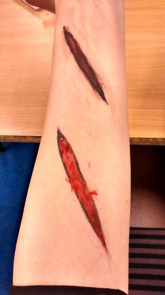
This my group experimenting with paint. We will be using this when the main character cuts her arm with the knife in one of our shots. We decided as a group we would use the second cut as it looks more realistic and more like a cut. We only used paint for it but when we actually shoot we will be using wax to make it look like she has actually cut her skin. This fits the genre of a horror because a lot of blood is involved in the genre, also the main character cutting herself can connote to her not being able to take any more pressure. This is a picture of what we did during a filming session.
Thursday, 29 January 2015
Design
I have changed my blogs colours so it reflects design ideas. For example you can see that i have used black with white writing. this has been used because dark is a sinister colour and most horrors and dark. another reason is because there is more black than white. This gives the effect that light is being prevailed by darkness.
Music and sound effects location
This is the location where we can get possible sound effects and other sounds. it contains hundreds of sounds that we can use so we can make our horror opening sequence more original, unique and conventional. all of the sounds or music are copy right free which means we will not lose marks for copyright on the mark scheme. Also when we are choosing what music we are going to use we need to all agree to ensure that we all have shared interests in the music which is being used.
Subscribe to:
Posts (Atom)


